Blog
Published on 18/02/2026
Roku tests a new home screen in 2026: personalization and discovery at the center of the experience
A home screen designed to reduce decision time
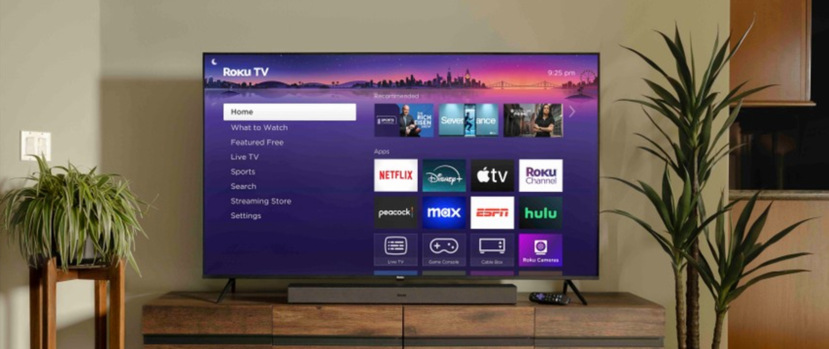
The new layout places the content grid at the center instead of the traditional side menu. In practice, when users press the Home button on the remote, the cursor lands directly on content, reducing the steps needed to start watching something.
This change reflects an important strategic shift. Platforms no longer compete only on catalog size but on how quickly users can find something to watch. In an increasingly fragmented ecosystem, navigation experience becomes an integral part of the service’s value.
Quick Access and smarter recommendations
Among the main additions is a section called Quick Access, which automatically displays the most-used apps. The goal is to simplify entry into favorite platforms without requiring manual setup.
Alongside this, Roku is strengthening its recommendation systems through sections like For You, an evolved version of its previous content suggestion tool, designed to provide more relevant proposals based on viewing habits. New editorial pathways have also been introduced to browse thematic categories such as new releases, genres, or viewing moods.
More visibility for platform-native content
Another key element of the redesign concerns the greater exposure of existing but underused features. Options such as Live TV or free content are now positioned directly on the main home screen, with the aim of increasing user discovery.
This choice follows a broader streaming industry logic: it is not enough to have features, they must be immediately visible. Many services are now working on interfaces that actively push content and viewing paths, reducing the need for manual search.
Advertising and monetization: the layout changes, not the strategy